Solidrocker
04/01/05 11:29pm

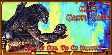
been a long fuckin day, so it doesnt look that great
Mona Lisa
04/01/05 11:34pm
Not bad. Have you seen the Blood of Dracula font? Check it out. The background is excellent!
ML

Solidrocker
04/01/05 11:47pm
yah i was gonna use that font but i decided to try this one.... thx on the bg!
Solidrocker
04/01/05 11:56pm
her is a SW sig i put together'

I like the first one but the second one is H0TT
They're both cool. That's the problem. You need to "gay" them up about 50%. That's more Nates style.
I like the second one... gj solid. I still think your border could look nicer though, try changing the settings in bevel & emboss
Solidrocker
04/02/05 9:28pm
what settings do u use sauce?
Solidrocker
04/02/05 11:34pm
i fixed the quote
CODE
[IMG]http://img.photobucket.com/albums/v336/Solidrocker/natesig.gif[/IMG]
Mona Lisa
04/03/05 2:16pm
Great! The font shows up and the colors are bright. You make interesting borders too.
ML
Solidrocker
04/07/05 2:24pm
once again i fixed the text
CODE
[IMG]http://img.photobucket.com/albums/v336/Solidrocker/natesig.gif[/IMG]
Congrats, everything spelled right.
This is a "lo-fi" version of our main content. To view the full version with more information, formatting and images, please
click here.

